

UXPALA
Design Sprint
Designing a resource landing page to assist new and seasoned UX professionals in furthering their career.
Background
UXPALA (User Experience Professionals Association of Los Angeles) aims to not only inform UX professionals about resources, tools and trends through our events, but also with functional lists of useful items for designers on our website.
In the past year, UXPALA has been collecting information relevant to UX designers that we want to showcase this on UXPALA.org. This includes the educational database, design communities on various platforms, UX best practices, and the Monster List of UX Books. For this design sprint, we came up with an idea for a page where UX professionals can find these valuable resources and more.
The Challenge
Within a 2 week design sprint, our team was tasked with designing a resource landing page concept for displaying various types of resources UXPALA has available currently. I collaborated with 2 other UX Designers to build and deliver high-fidelity mockups to the rest of the UXPALA team.

Role
UX Designer
Key Contributions
Sketching
Wireframing
Low & High Fidelity Designs
Team
3 UX Designers
Tools
Pen & Paper
Zoom
Adobe XD
Mural
Scope
2 weeks
The Solution

THE PROCESS
Understand
User Stories
User Flow
Explore
Competitive Analysis
Ideate
Sketching
Design
Medium Fidelity Mockups
Understand
OUR USERS
New UXer
Someone who just graduated from a bootcamp or from school and needs resources to get a leg up in the industry
Seasoned UXer
Someone with 2-10 years of experience, trying to stay current, network, mentor and really be in tune with the UX community
THE GOALS
Business Goals:
-
Make it easy for users to contribute and suggest resources
-
Cross-link and tie resources or resource sections back to events and other related content
User Goals:
New UXer:
-
Quickly find information suitable to what I’m interesting in regards to career growth
Seasoned UXer:
-
Stay current and in tune with what’s coming soon
-
Find a job matching my specific skill set
How might we design for the most common things beginning and seasoned UXers may be looking for?
USER STORIES
Understanding our user stories that display the task and goals of the user, helped us recognize potential solutions and that could help accomplish these goals.
-
When I am new to the UX field,
-
I expect to quickly find information on career growth, so I can position myself to find my first job and network with others
-
-
When I am a seasoned UX professional,
-
I expect a way to keep myself knowledgeable with the UX landscape, so I can find the right next steps for my career and/or project
-
HIGH LEVEL USER FLOW
Next, we analyzed the high-level user flow to visualize the process that a user would go through in order to accomplish their goal.

Explore
COMPETITIVE ANALYSIS
Before brainstorming our ideas for our resource landing page, my team wanted to learn more about what content that other websites use to provide resources to their users and how they organize their content overall. We observed websites Khan Academy, UX Planet, and Smashing Magazine.
Khan Academy
Khan Academy simplifies and organizes their content really well. We see that they utilize playlist style cards to organize their different topics within a main topic.
For our design, we could use a similar design to help users easily scan different types of content by creating a similar style card system.

UX Planet
UX Planet does a great job at creating original content and displaying them in a way that is easy for users to find things. Most notably, their tabbing system allows for UXers and all levels to find what they need, very easily.
For our design, we could implement a similar tabbing system to help users and different levels of their career.
Smashing Magazine
Smashing Magazine provides various types of resources for their users such as articles, guides, books, and more.
When thinking of what type of content would best fit into our resource landing page. This site, along with UX Planet helped us understand what type of content would be useful for UXers that we would want to display on our resource landing page.

Ideate
 |
|---|
 |
 |
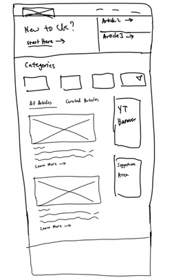
ROUGH SKETCHES
Next, all 3 designers met through Zoom where we each started generating ideas for the features and visual design of the landing page such as:
-
Creating a hero section at the top that highlights our most recent or most valuable content
-
Adding a tabbing system that displays content for different levels of users
-
a section in which users can suggest resources that aren't on the page
Here are a few concepts which we explored further before creating the first iteration of our designs:
-
Organizing content so that would it be easier for UXers of different levels to find
-
Considering the hierarchy of how content should be placed within the landing page
-
Decide on what content would be most important for UXers who come onto UXPALA website to look for resources
Design
After going over a few iterations on our designs and receiving feedback from the rest of our content strategy team, we decided on the final designs below. These final designs were posted and presented on the Mural app.
FINAL DESIGNS


Outcomes and Reflections
Collaborating with 2 other UX Designers was such a great learning experience! I gained a lot in being able to see how other designers work and formulate their processes when tackling a design problem. Within this sprint, I learned the hierarchy of content on a page is very important. I was reminded to ask myself, 'what information matters most to the user?' and 'what is their hierarchy of needs' when adding content to a page.
If given more time to work on this, the team would have wanted to carry out usability testing with users with actual content within the pages of our design.